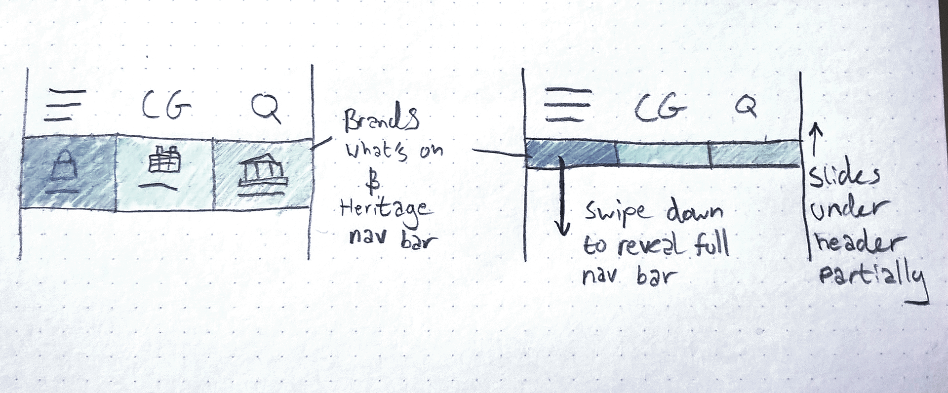
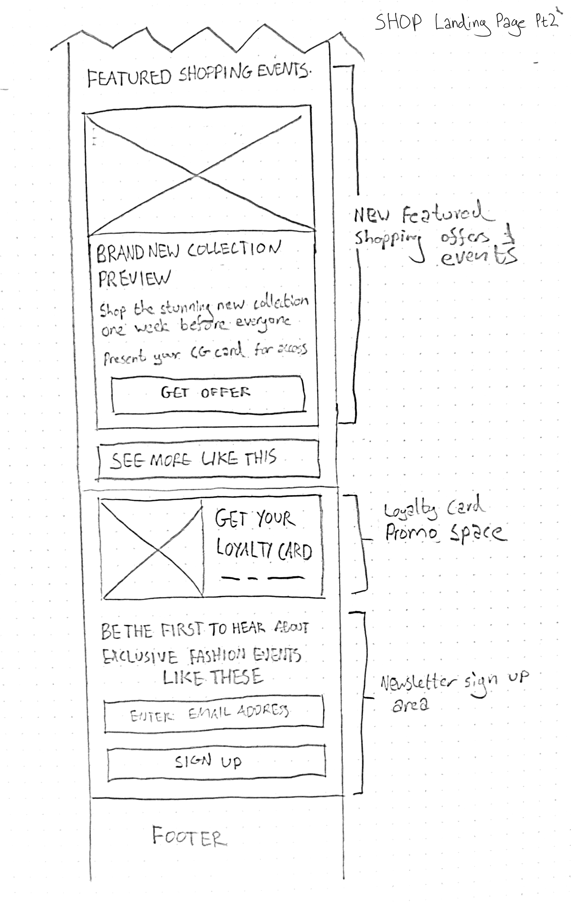
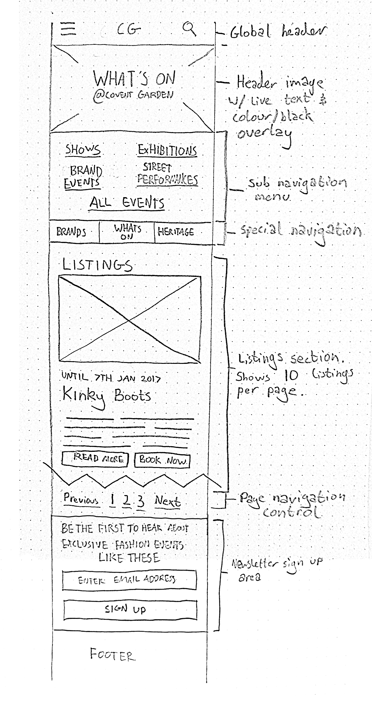
Following a research period where we identified 4 ideal visitor personalities, I mocked up a prototype site map, and intuitive user journeys for each. Next job on the list was to sketch out the interface.
I included a bespoke icon pack, featuring some of the recognisable buildings and attractions of the Covent Garden area.
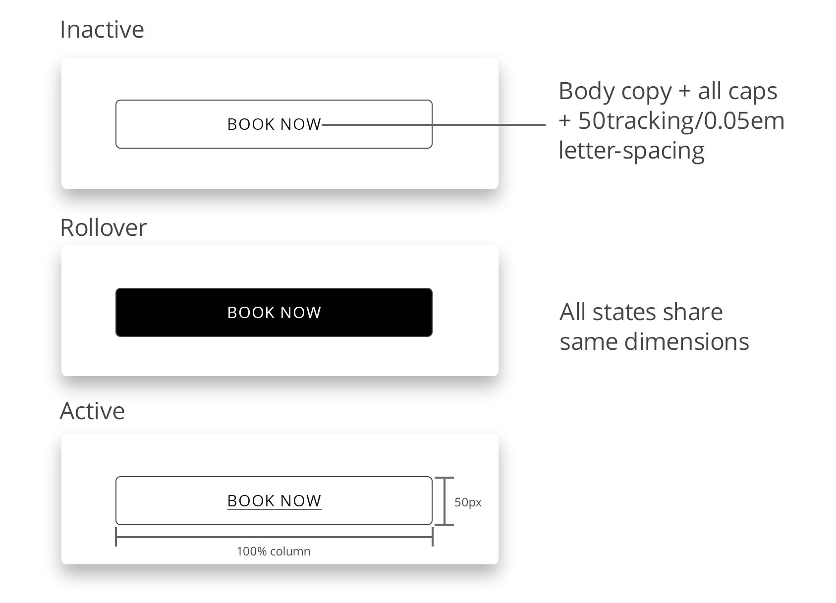
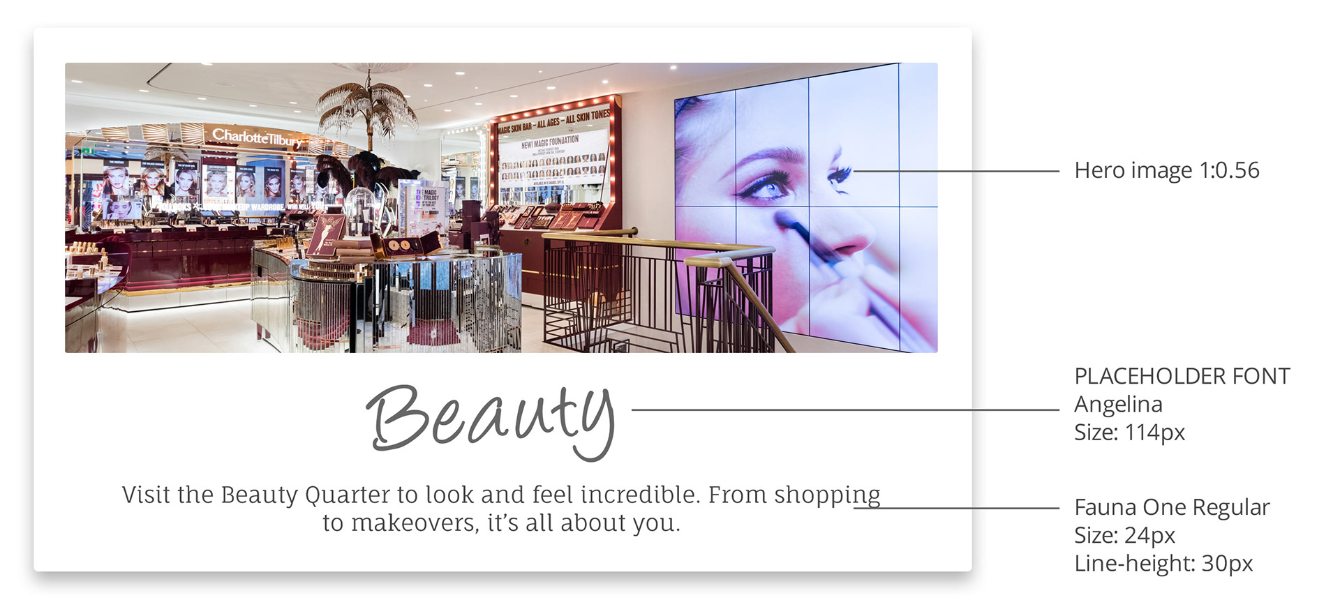
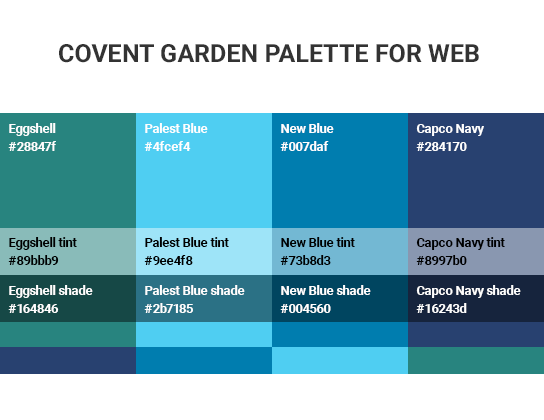
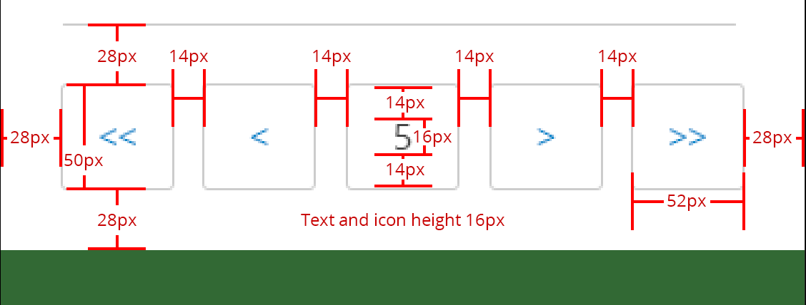
After fussing over the details, it was time to hand over to the developers. This posed a challenge as every element had to be consistent with the new guidelines. To achieve this, each and every page element was provided as workable files and included layout diagrams. This gave us the exact look we had specified.
Since publication, the traffic, clicks, email subscriptions and time spent have all had significant increases.
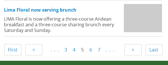
Below are a small collection of the mockups and guideline images from my working folders. Included to give an idea of some of the detailed work that went into this project.
